Seeing cyber threats in real time
A network-security product for analysts, built around dense, real-time visualization with a film-grade look.
An interface that looked like it came from a film, for analysts who needed to find a live attack in seconds.
ProtectWise recorded a company’s entire network traffic in the cloud and continuously replayed it against new threat intelligence, so analysts could see attacks as they happened and find ones they had missed. Its Visualizer was one of the most complex, data-rich products I’ve worked on. I designed across the whole of it, and my part was making that density work for the people who used it every day.
The Visualizer
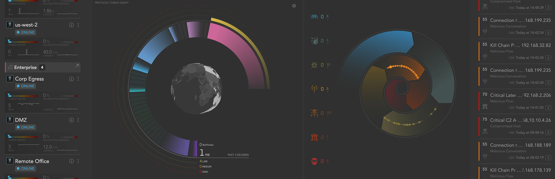
The Visualizer’s look came first: its visual direction was set by a designer known for film interfaces, and it was deliberately dense, dark, and alive. Rings of protocol and threat activity spin around a globe, events stream in from the edge, and everything moves in real time. It was striking, and it was a lot. The design work was to make that complexity usable for analysts working an incident under pressure, without flattening what made it powerful.
I joined as one of two Lead UX Architects reporting to the VP of Engineering. We made the case for a full-time UX researcher, and her field research with analysts, who walked us through real incident-response scenarios, grounded the redesigns that followed. When the other designer moved to a longer-range labs effort, I took over design for the whole core product. I built it hand in hand with the lead UX engineers, Richard Trott and Jason Johnston, whose craft is a big part of what you see here.
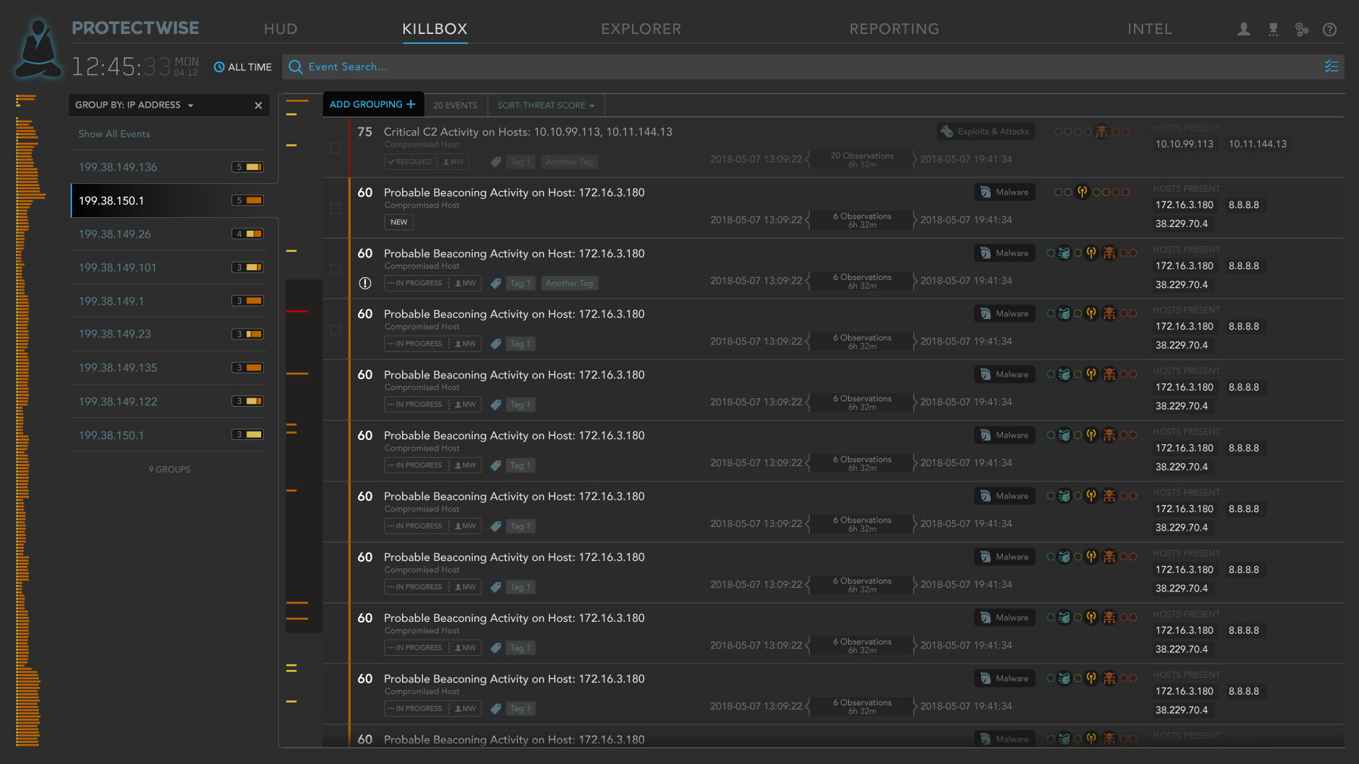
The Killbox is the analyst’s inbox for threats as they happen, and the most-used part of the product. In 2018 I redesigned it with the product manager and our lead UI engineer around what customers had told us for years: letting analysts group events, by host for example, so a burst of related alerts reads as one story, not fifty rows.
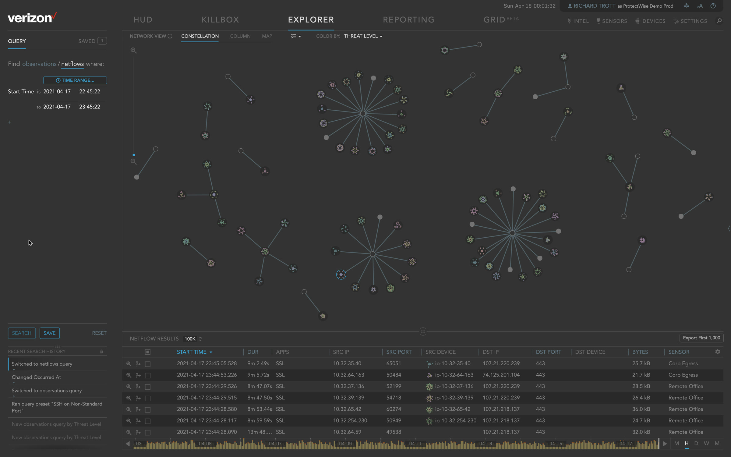
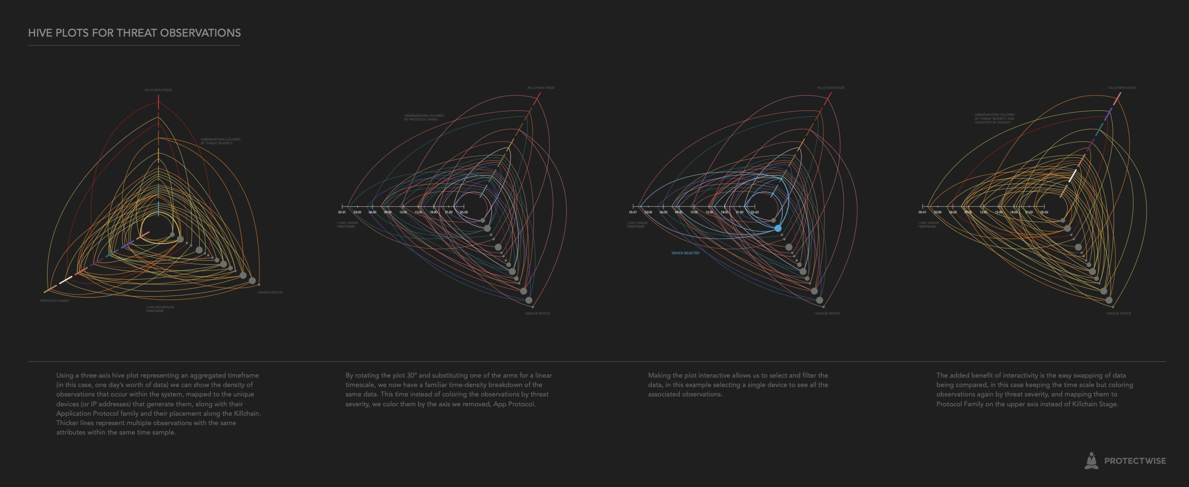
Not everything shipped. I sketched hive plots as a way to show a day of threat observations across three axes at once (attack stage, device, and protocol), then turned one axis into a timeline and made it filterable.
Sensors
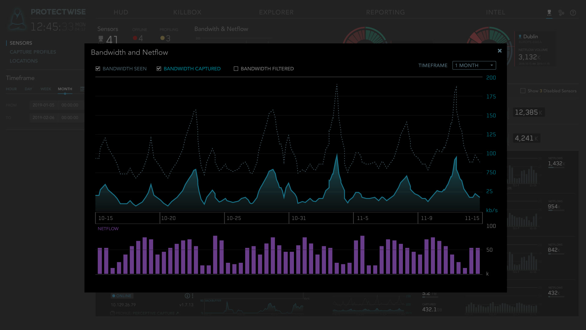
Everything in ProtectWise depended on sensors: lightweight software on a customer’s network that captured the traffic. If a sensor went quiet, the customer was blind, so sensor health had to be impossible to miss.
The original sensor page showed a card for every sensor. That made sense with a handful. Large deployments ran dozens, across regions, and the cards turned into a wall you had to scroll and read one by one to find the one in trouble.
I designed the new dashboard with the lead engineer and product manager, bringing in subject-matter experts as we needed them. Sensors roll up into groups, by region or however a customer organized them, and each group shows its health, throughput, and capture at a glance. Anything offline or struggling shows in red, so trouble surfaces before you dig in. Then you drill in: open a group to see its sensors, and a sensor to see its charts and manage its configuration.
Design for the deployment a customer will have, not the one they have today: roll up to spot trouble, drill down to fix it.
Bring Your Own Intel
ProtectWise detected threats with IDS rules in the Suricata format, mostly from commercial and open-source feeds like Emerging Threats. Those covered most threats, but intelligence analysts always had special cases: rules they wanted to tune for their own systems, or rules they had written themselves.
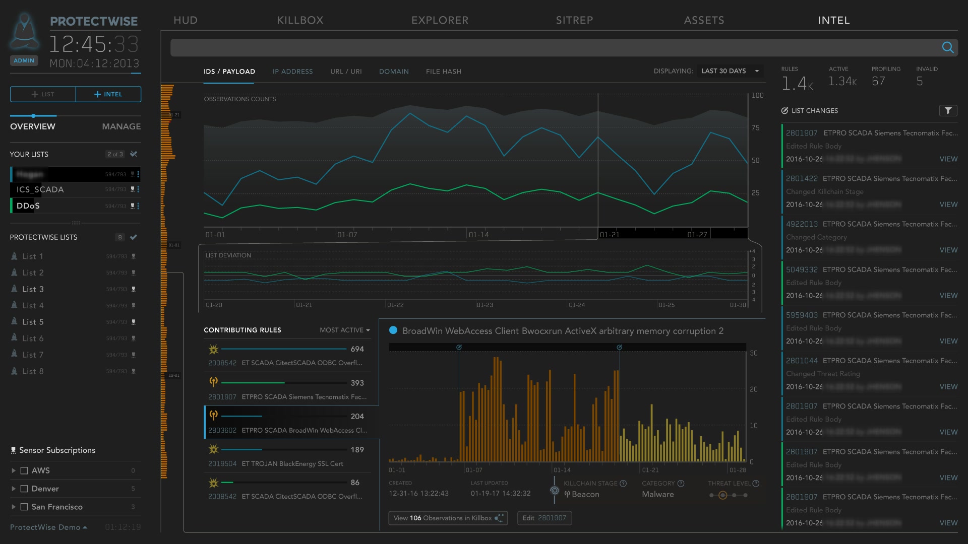
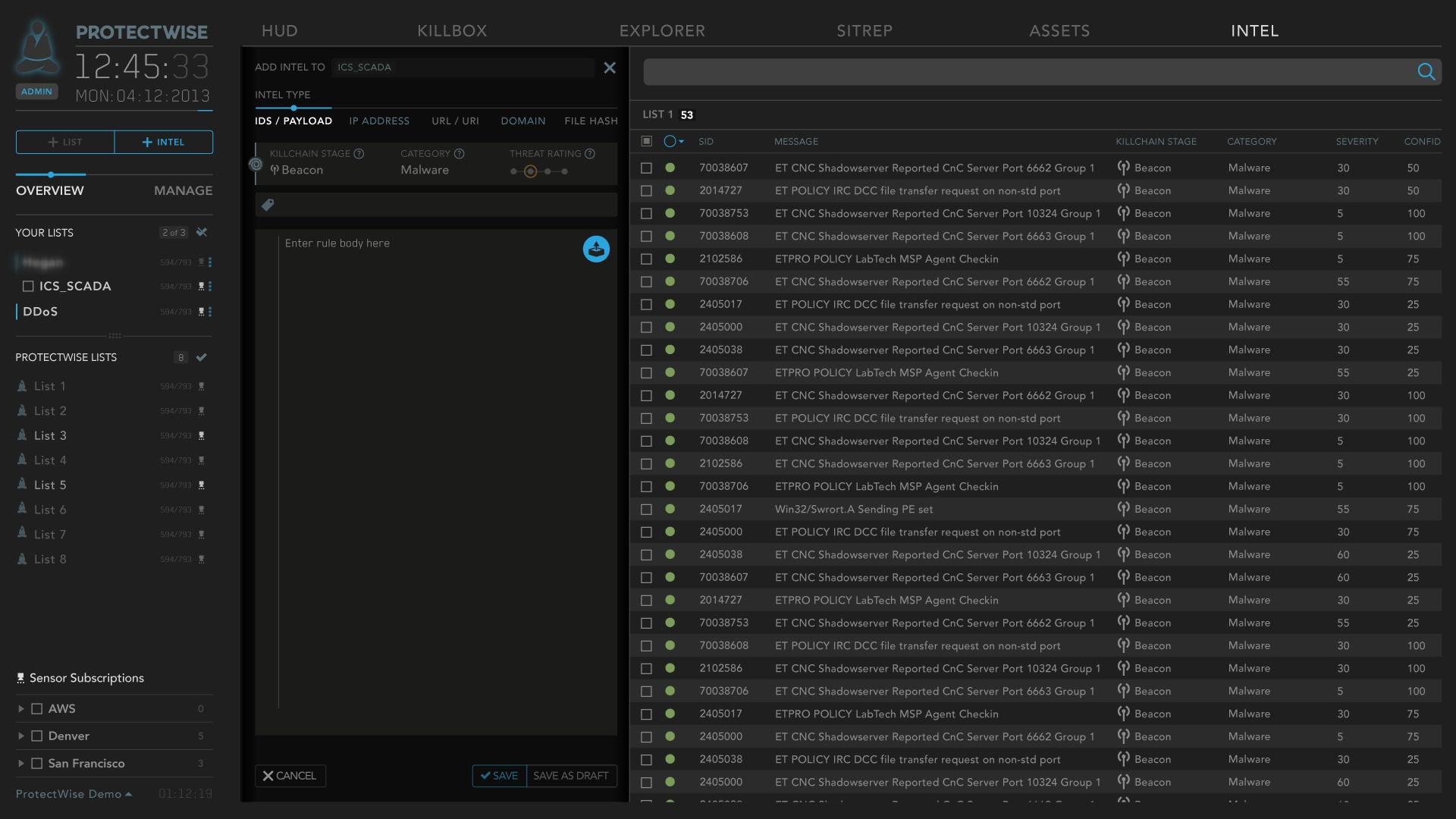
Bring Your Own Intel opened the platform to them. Analysts could upload and manage their own rule lists, tailor what the product watched for, and see how their rules were performing. I designed three parts: the workflow for adding intel, list management, and a performance dashboard showing which rules were firing and what had changed.
We also talked about where it could go next: a marketplace where analysts could buy and sell intelligence sets. We never built it, but the idea stayed with me.
What came next
In 2019 Verizon acquired ProtectWise. I was pulled in to work with the owner of Verizon’s unified security platform, ATLAS: a large effort, already under way, to bring dozens of security products, most of them with little or no interface, under one experience. The direction I gave it was “unified access, not unified interfaces”: a central security home, single sign-on, a shared navigation and product switcher, and a common component library as a starting point rather than a mandate. I shaped that direction for a while, and the team was building some of my recommendations when I moved to a different team at Verizon.
Looking back, the lesson I carry from ProtectWise is about complexity. People can handle far more than we give them credit for. Nobody expects to fly a 747 the first time they see the cockpit, and even pilots retrain when they move to a new plane. Software is the same: people learn through repetition, and their understanding grows with use. So I’d rather test whether people can learn something than whether they get it at first glance, and design to bring them along: roll-ups before details, a calm first step, and an escape hatch when it gets to be too much.
It’s the same bet this site makes: a sky to explore, and a plain version to read for anyone who’d rather not.
- Company
- ProtectWise / Verizon
- Timeframe
- 2016–21
- My role
- Lead UX Architect; later de facto design lead for Verizon's security products
- Data visualization
- Visual design
- UX research